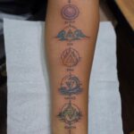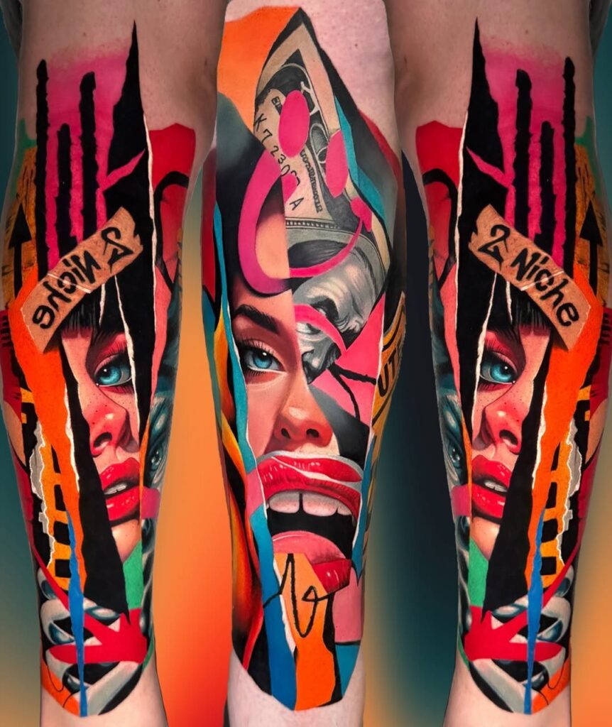
A colored tattoo design can run from a single fine-line blossom behind the ear to a full back piece of Japanese koi and clouds, and the deciding factor is how much room you are willing to give the work.
The style you choose, whether realism or watercolor or neo-traditional, determines whether you are in the chair for one session or many.
SPF 30 is the minimum for anything that heals, but watercolor and delicate florals die faster than bold neo-traditional outlines without it.
1. Realism Tattoos
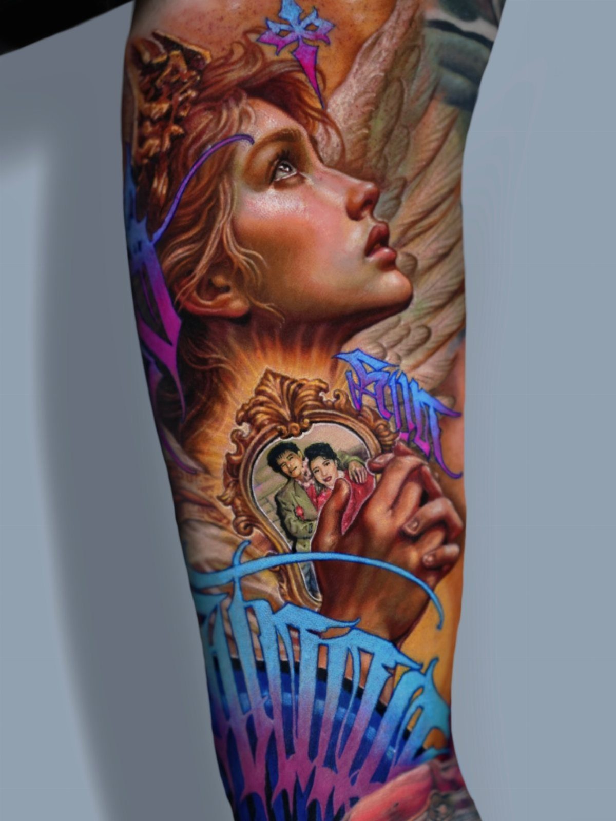
A color realism sleeve turns skin into a surface that holds actual light and shadow, not just symbols of them.
Layered hues and controlled highlights make faces read from any angle, which is why this style demands an artist who understands anatomy as pigment, not just line.
Portraits of family members work best on stable areas like the upper arm, thigh, or outer forearm.
Joints and high-movement spots break the composition and blur fine details over time. If you want memorial work or animal faces, plan for multiple sessions and a budget that matches the complexity; this is not a same-day walk-in style.

Professional Tattoo Ink - Many of the most popular tattoo artists around the globe turn to World Famous' bold, beautiful tattoo ink, tattoo supplies & tattoo kits to deliver a flawless work of art.

100% new brand and high quality. Favored among professional tattoo technicians.

MADE IN THE USA SINCE 1990: For over 30 years Dynamic Color has produced professional tattoo ink in the United States, an established American brand artists built their work on long before most imported labels existed.
2. Watercolor Tattoos
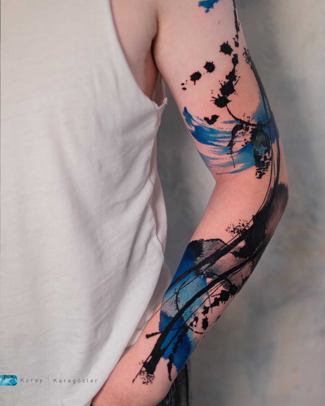
Watercolor tattoos let color do the work that outlines usually handle. Blue splashes and black spatters create shape through transition and open skin, not through a border you can trace with a finger.
This style borrows from actual painting: fluid edges, layered pigment, and the sense that the image might still be moving.
A lotus, bird, or mountain scene can communicate mood without demanding photographic accuracy. Soft blends can blur faster than hard lines, and sun exposure matters more here than with traditional work.
If you want strict realism, choose something else. If you want the tattoo to feel like a feeling rather than a photograph, this is the path.

TATTOO SUPPLY KIT: Tattoo ink mixer machine with 100 Tattoo ink mixing sticks. Durable and long-term use. The tattoo ink mixing stick is made of high-quality materials, sticks are only one time use, clean and sanitary.


WHAT YOU GET:The package includes 500pcs disposable tattoo ink mixing sticks. The ink mixer stick measures 1.3 x 0.2 inches / 3.4 x 0.4 cm. It is small and light enough not to overload the mixer
3. Neo-Traditional Tattoos
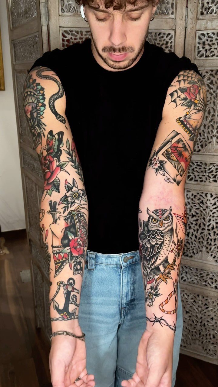
Neo-traditional work keeps the bold outlines that make tattoos readable from across a room, then adds shading and color variation the older style rarely attempted.
The owl, roses, and snake above use deep reds, bright blues, and warm yellows separated by those strong contours so nothing visually bleeds together.
This style suits animals, skulls, flowers, and symbolic objects when you want something that will still scan clearly in 10 years.
The colors run richer than American traditional: earthy greens, pastel pinks, lavender, mint. The artist needs to understand how to build dimension without losing the silhouette, so portfolio review matters.


Two koi carp - one red, one golden - spiral in a yin-yang formation within a bold circular border. Framed by green seaweed, river stones and rising bubbles, this neo-traditional tattoo flash design captures the timeless beauty of Japanese koi pond art.

Two koi carp - one red, one golden - spiral in a yin-yang formation within a bold circular border. Framed by green seaweed, river stones and rising bubbles, this neo-traditional tattoo flash design captures the timeless beauty of Japanese koi pond art.
4. Floral Tattoos
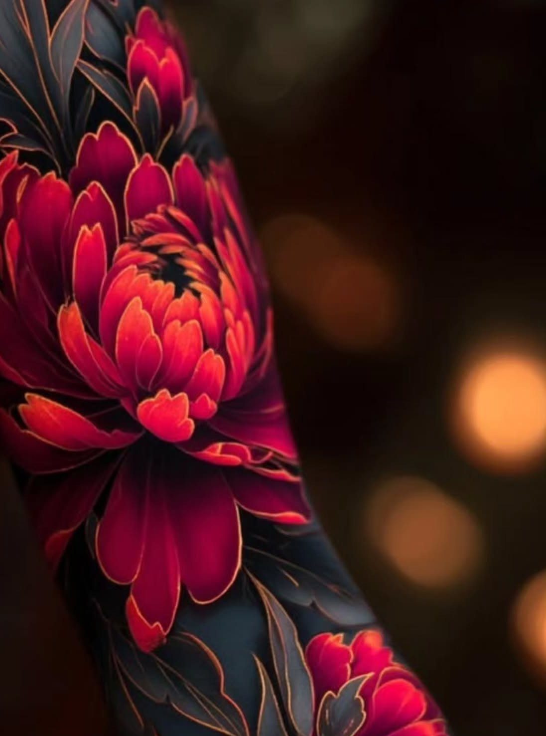
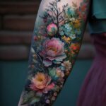
Floral tattoos adapt to almost any color approach you prefer. Chrysanthemums work in saturated reds with gold outlines, but the same flower could render in loose watercolor washes or tight botanical accuracy.
A butterfly with lilacs and apple blossoms woven through its wings updates an old trend into something current.
The natural curves of flowers guide the design around body contours more gracefully than rigid geometry, which is why sleeves and back pieces in this theme hold together so well.
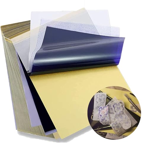
Standard size: Tattoo Transfer Paper is standard A4 paper size, each measures 8.27 in X 11.69 in. There are 4 levels in total. The thickness of the paper is very light and smooth to the touch.

Warm Tips: The tattoo transfer paper need to work with transfer medias.You will need to purchase the stencil ointment separately. Apply the design made on the master paper. Please pay attention to press the back side of the pattern to the skin for at least 3 seconds
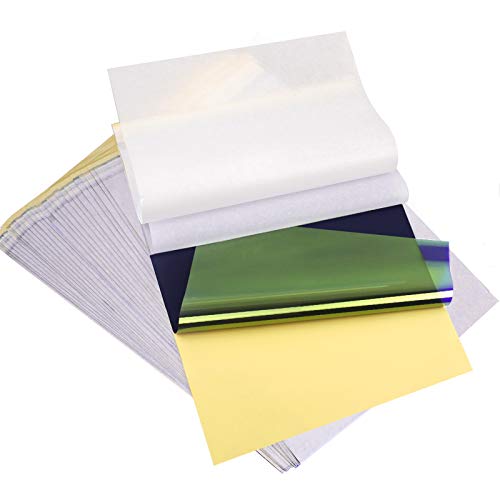
ADVANCED MATERIAL: Tattoo transfer paper is made with the high quality dyes and stencil paper. Transfer marks are very clear, clean and smooth. Tattoo transfer paper kit come with 35 sheets. Great for tattooing, trace and transfer images onto the body.<br>
5. Japanese Tattoos
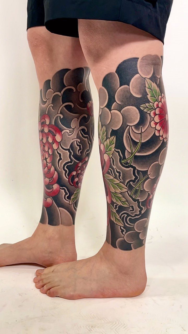
Japanese tattoo art builds the body into the design rather than placing isolated images on it. The clouds, wind bars, and chrysanthemums above connect across both legs so the composition flows with movement, not against it.
Koi, dragons, samurai, and waves are arranged to follow limb direction or wrap the torso.
Color supports the subject and separates overlapping forms; water links forearm to upper arm, blossoms guide the eye through open space. Japanese tattoos are large-scale work that rewards patience and an artist trained in the tradition.

Tattoo-Safe Mineral Formula: Our tattoo sunscreen lotion uses non-nano zinc oxide, a physical barrier that sits on the skin to block UVA/UVB rays without penetrating or irritating tattoos. This helps prevent fading, discoloration, or damage to tattoo ink caused by sun exposure.

TATTOO AFTERCARE ESSENTIAL: Hustle Butter is the original tattoo aftercare balm for new and older tattoos. With over 10 years in the market, we are a pioneer of the tattoo aftercare category.

COMPLETE AFTERCARE KIT FOR NEW & EXISTING TATTOOS: This Tattoo Aftercare Kit brings together 3 essentials, Antimicrobial Soap, Tattoo Balm, and Tattoo Lotion, to help cleanse, protect, and moisturize fresh ink. Useful after tattoo sessions and throughout healing, it supports vibrant color and skin comfort for dedicated ink enthusiasts and artists
6. Illustrative Tattoos
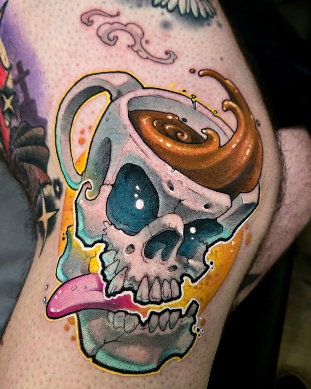
Illustrative tattoos preserve the energy of a working drawing rather than polishing it smooth.
Varied line weights, loose marks, and selective color create the effect.
Illustrative tattoos suit custom characters, literary references, and strange little creatures; no color is off limits, but the artist needs to understand how to keep linework legible as it ages.
Ask for healed photos of pieces with similar detail density before you commit.

Tattoo ink Renowned for its smooth flow characteristics, our inks are designed to excel in any tattooing task—from intricate detailing to outlining and shading

💖 Express your creativity with this Tattoo Ink Set, featuring a colorful array of vibrant hues and shades.

100% new brand and high quality. Favored among professional tattoo technicians.
7. Pop Art Tattoos
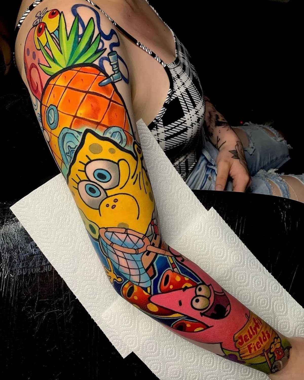
Pop art tattoos pull from comic panels and advertising graphics: halftone dots, bold outlines, and saturated color blocks that read from across a room. These cues can turn a cartoon scene into something that feels printed on skin.
This style works best when the design does more than copy a screenshot. A dynamic pose suits the length of an outer arm; a compact emblem fits the calf or upper arm better.
Action lines and exaggerated shadows keep the image active without needing motion. The artist should show healed work with similar line weight, since those thick borders must stay crisp to carry the whole piece.

Water-based tattoo ink, easy to wipe and color in the process of tattooing, suitable for various styles;

MADE IN THE USA SINCE 1990: For over 30 years Dynamic Color has produced professional tattoo supplies in the United States, an established American brand artists built their work on long before most imported labels existed.

1.MULTIPURPOSE-This electric tattoo pigment mixer can be used for tattoo ink,watercolor Ink,painting pigment,microblading supply tool ect.
8. Delicate Flowers
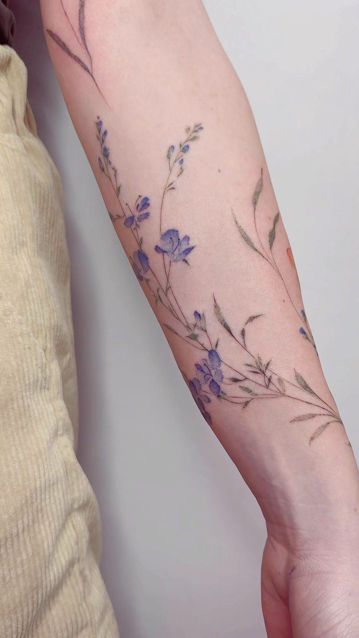
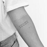
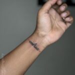
Thin stems and miniature blossoms suit spots where you want color without weight: the inner forearm, collarbone, or behind the ear. Fine-line work and restrained green keep a floral design breathable on pale skin.
This approach trades longevity for subtlety. Lines this slim can soften faster than bold work, so placement matters: low-friction areas hold detail longer.
Ask your artist to show healed photos from past clients before you commit. If you want the symbolism without the fragility, a slightly thicker stem or added dotwork around the blooms buys you more time before a touch-up.

Nine-pin tight round liner on a standard long bar; #12 gauge 0.35mm diameter; long taper draws ink to nine grouped points with controlled volume per pass, producing a bold saturated outline stroke that lays in cleanly without flooding the channel or requiring multiple passes over the same line


Two koi carp - one red, one golden - spiral in a yin-yang formation within a bold circular border. Framed by green seaweed, river stones and rising bubbles, this neo-traditional tattoo flash design captures the timeless beauty of Japanese koi pond art.
9. Surrealism Tattoos
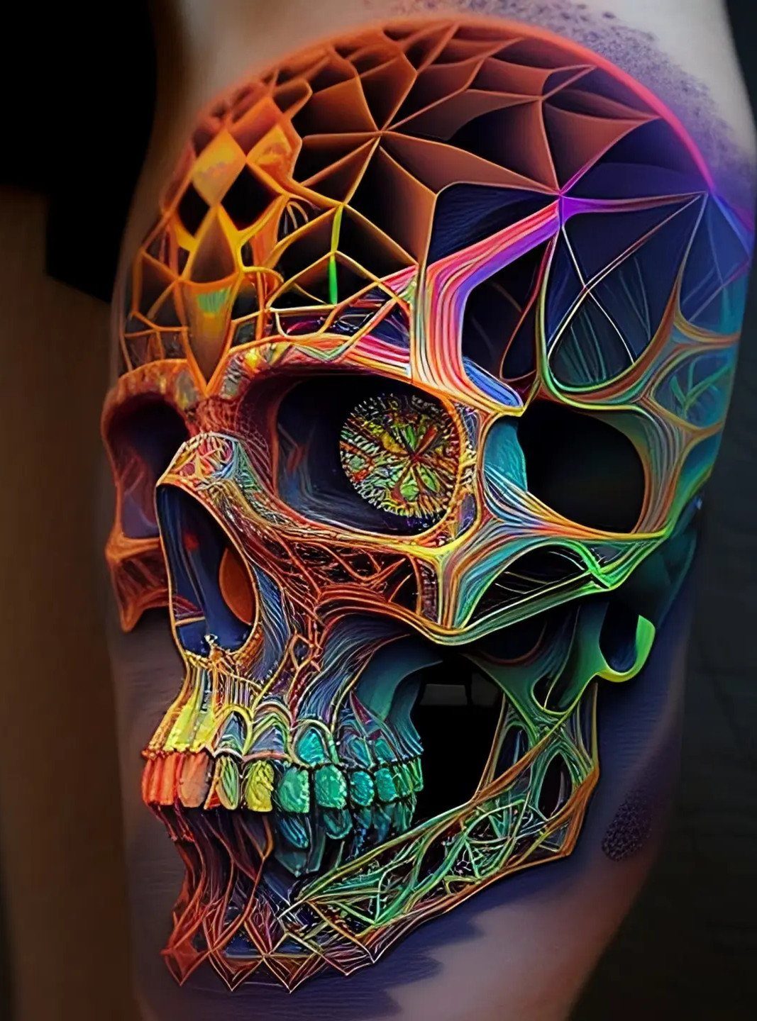
Surrealist color work lets a skull dissolve into rainbow geometry or a clock melt across ribs in ways realism cannot permit.
Webbed lines and unconventional hue shifts can break a subject apart and reassemble it as something from sleep, not waking.
This style demands an artist who understands both structure and how to abandon it. The composition must hold together visually even when the imagery refuses logic; too many competing elements and the tattoo becomes noise.
Plan for longer sessions and a higher budget than simpler color work. If you want the dreamlike effect without full commitment, a single surreal element inside an otherwise coherent design can test the water.

Precision Transfer Performance - It’s professional-grade tattoo stencil paper delivers vibrant, high-definition transfers even for intricate designs. The carbon layer ensures sharp outlines without smudging or fading, ensuring crisp lines that stay true to your original artwork.

Precision Transfers & Long Lasting: Tattoo stencil paper delivers vibrant, high-definition transfers even for intricate designs. Creates crisp, dark lines that transfer cleanly to skin (clearly on different skin tones) which are easy to follow during tattooing. The carbon layer made from high-quality dyes ensures sharp outlines without smudging or fading and maintains crisp lines visibility throughout long tattoo sessions, so you can focus on creating art instead of re-drawing lines

Spirit Tattoo Classic Thermal Transfer Paper, 8.5” X11” (100 Sheets): Established since 1946, the original and trusted choice of tattoo artists globally, offering reliability and consistency in tattoo stencil creation.
Tattoo Care and Longevity
Color work lives or dies in how you treat it after the needle stops. Healing sets the foundation: a tattoo that scabs thick or dries out will lose saturation before it ever sees sunlight.
Once healed, UV exposure becomes the real enemy. SPF 30 on exposed ink is the minimum, not a suggestion, especially for watercolor or delicate styles where subtle transitions carry the whole piece.
Well-saturated color with strong contrast stays readable for years.
Weak saturation fades faster, and no amount of aftercare brings it back. The artist handles saturation in the chair; everything that happens after that is on you.

FOR ALL SKIN TYPES, INKED OR NOT - This daily, 100% mineral sunscreen works hard to protect skin and tattoos from the damage caused by exposure to harmful UVA & UVB rays.
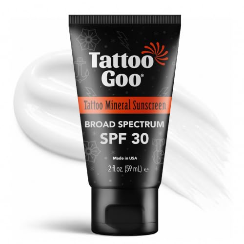
Tattoo-Fade Protection – Shields tattoos from UV damage to help preserve vibrancy and detail with a lightweight formula that doesn’t leave any white film residue.
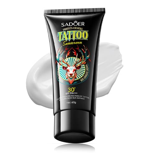
ULTIMATE SUN PROTECTION FOR TATTOOS & SKIN: Our advanced SPF 30+ formula delivers broad-spectrum UVA/UVB protection while locking in tattoo vibrancy. Suitable for all skin types – inked or uninked – its compact size fits your pocket easily, making it perfect for daily on-the-go protection.
Consultation Importance
A consultation is where you test whether an artist actually listens. Bring reference images, then watch what they do with them.
The right artist will push back on placement that fights the design, suggest hues that read on your specific skin, and explain why a color palette needs adjustment for the spot you chose.
This conversation should happen before any deposit changes hands.
Fresh color always looks brighter. Healed work tells you whether the artist understands how pigment settles.
Skin Tone Considerations
Your skin’s undertone and overtone both filter what comes through. Warm sunset tones read nostalgic and inviting on most skin; cool blues and violets pull peaceful or introspective.
The same red ink heals differently on warm undertones than on cool ones, and an artist who works across skin types knows this without being told.
Ask specifically for examples on skin near yours in tone, not just the artist’s best portfolio piece. Plan placement around friction and movement first, then let the gradient or palette follow that choice.
Frequently Asked Questions
What is the 1/3 rule tattoo?
I have never heard a working artist use the phrase "1/3 rule" in a shop, and searching for it mostly turns up blog posts quoting other blog posts.
This may refer to composition guidelines in visual art, where dividing a design into thirds creates balance, or to placement rules some artists use for sizing.
If you are hearing this from an artist, ask them to walk you through exactly what they mean by it.
Is it worth getting colored tattoos?
Color work is worth it if you want depth, mood, or visual impact that black and gray cannot provide. Layered pigments and controlled saturation create realistic dimension in portraits, emotional tone in watercolor pieces, and readable symbols in neo-traditional designs.
The trade is more aftercare discipline and faster fading without sun protection, so your commitment to maintenance matters as much as the artist’s skill.
What are some cool tattoo colors?
A forearm running sunset orange into pink, then purple, then blue uses the length of the limb like a horizon line; the gradient has room to breathe.
Pastels have grown more common in recent years, though they demand extra attention to healing and sun exposure to hold their subtlety.
Do colored tattoos last?
Your immune system never stops attacking ink particles, which is why every tattoo fades, but heavy saturation and sharp contrast buy you years of readability if you keep the sun off it.
Do color tattoos require multiple sessions and touch-ups?
A palm-sized color piece might close in one sitting, but a full sleeve or back piece with layered color fields gets scheduled across months; the skin needs recovery time and the artist needs to see how earlier layers heal before adding the next.
Most color work benefits from one pass of tightening after the first heal, though an artist who packs pigment properly and a client who follows aftercare can push that appointment years out or skip it entirely.
What makes a color tattoo look professional and long-lasting?
Strong contrast, smooth blending, balanced shading, clean negative space, and proper saturation all contribute.