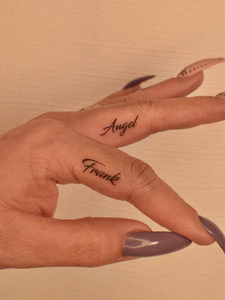
A small writing tattoo on finger runs from a single initial to a short word plus one symbol, with the deciding factor being how much you want the meaning to stay private versus readable at a glance.
The skin here is thin and close to bone, so every choice, from cursive flow to Roman numeral spacing, has to account for ink that spreads and a healing process longer than you’d think because hands never stop moving.
1. Single Letters
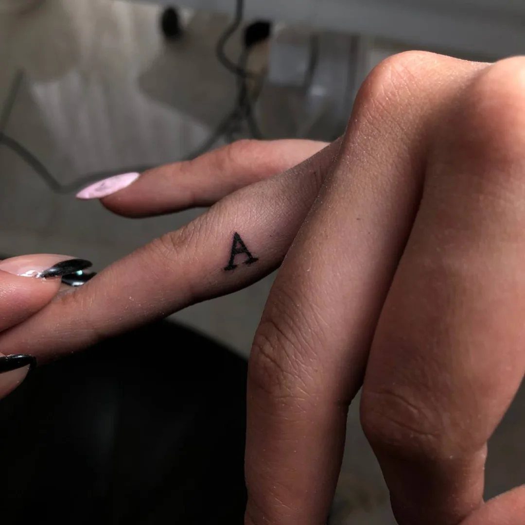
One letter on one finger is about as quiet as a tattoo gets. A cursive capital A, thin and flowing, sits on the side of the index finger where you see it but nobody else has to.
This works for initials, a child’s first letter, or your own.
The space is tiny, so the letter needs clean lines and no extra weight. Jay Shin’s piece shows the right balance: enough ink to hold, not enough to blur.
Pain here is sharp, the skin thin and close to bone.
Healing takes longer than you’d think because hands move, wash, and bump into things. Budget enough time for the artist to work small and slow, and plan on a touch-up once the skin settles.
A single letter is the test drive of finger tattoos: small commitment, real information about how your skin holds ink in that spot.

【TEMPORARY TATTOO PACK FOR MAN WOMEN ADULTS KIDS】Each Size is about 200 x 100mm / 7.87 x 3.93 inch. Contains 5 sheets temporary tattoo paper stickers which are printed with non-toxic ink.

SELECT BETWEEN MINI FINGER TATTOOS AND LARGER KNUCKLE TATTOOS: Each pack features a full alphabet set of iconic letter tattoos plus traditional style decorative designs including hearts, crowns, and classic tattoo motifs. Mini Finger Tattoos is a pack of 10 sheets of mini letters, letters = 1/4" Knuckle Pack is a pack of 2 sheets of 1/2" letters plus 2 sheets of 10 traditional style tattoos sized to fit on knuckles.

Premium Quality 1.5mm Silicone Material – Crafted from premium 1.5mm thick silicone, this tattoo skin offers a true-to-life feel with excellent durability and a smooth surface for effortless needle movement during practice.
2. Cursive Words
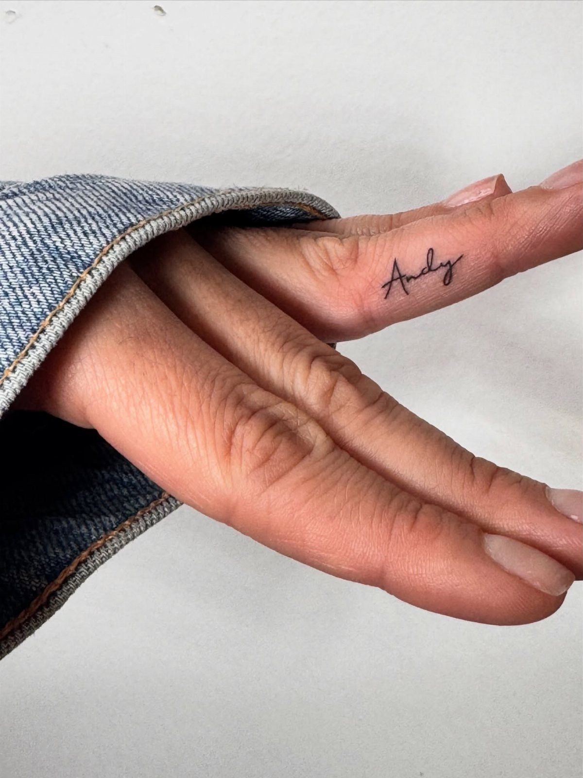
A name or a word in cursive turns the side of a finger into something that reads like handwriting at a glance.
A single name in cursive fits the index finger, where it shows when the hand opens and tucks away when it closes.
Words like "family," "grateful," or "blessed" fit this space if you keep the line weight fine. The letters need to connect cleanly; gaps fill in as the tattoo ages, so the artist should leave breathing room between strokes.
A heart tucked into the line of a cursive word works if the symbol stays simple enough to read at finger scale.
Short words fit best; anything longer than a handful of narrow letters starts to crowd the space.
Longer words crawl toward the knuckle and distort when the finger bends. Pick something that still means something when the person it names is not in the room.

Total 720 pieces of small temporary tattoo stickers: Contains 10 pieces of Gothic English number tattoo stickers, a total of 720 pieces, 2 styles of English letters A-Z, 2 sets of 0-9 numbers. Adopt waterproof ink, durable and provide semi-permanent effect. You can have a personalized tattoo, painless. Sufficient quantity, you can customize the letters and numbers to become your own temporary tattoo of phrases or sentences

Small Finger Temporary Realistic Temporary Tattoos for Adults: Discover our diverse collection of over 250 temporary tattoos, each measuring 5.7x9.7 inches. Perfect for teens and adults, our selection includes designs from celestial themes like suns and moons to nature-inspired elements such as letter and butterflies, suitable for a variety of events

★【18 Sheets 200+ PCS Small Finger Temporary Tattoos For Women Men Adults】--COKTAK Brand Mixed Style Black Small Temporary Tattoos For Men Women Adults Hot Fashion Variety Y2K Tiny Geometric Arrow Lotus Rose Flowers Leaf Leaves Sun Crescent Moon Butterfly Words Letters Finger Tattoo Stickers In One Package.
3. Inspirational Quotes
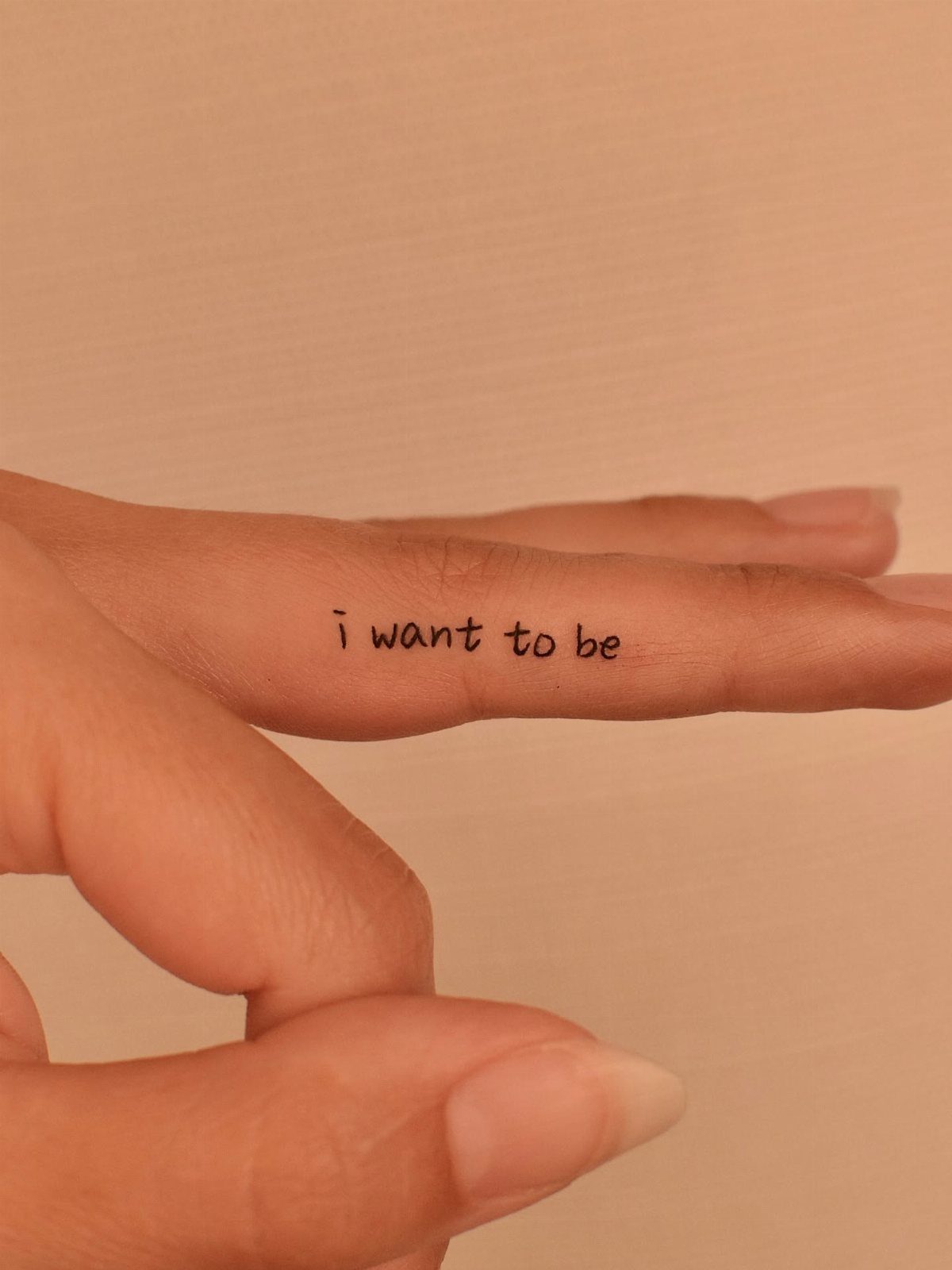
Short phrases on fingers run into the same problem: not enough real estate for grammar. A lowercase phrase already pushes the limits of finger space, but the style saves room without looking timid.
"Let it be" or "love" work better. The horizontal placement along the side, near where finger meets hand, gives a longer line than the pad.
Even so, count the letters before you commit. A period at the end, like the "grateful" piece, adds a full stop that helps the eye read it as complete.
Personal mantras beat borrowed Latin here.
A Latin phrase shrinks poorly; by the time it hits finger scale, the letters merge into a dark stripe. Pick something in your own language, brief enough that you have actually said it out loud in conversation.

Saving Paper & Cut Down Consumable Costs: Featured with a compact 2.2 x 3.1 inch printing area, which equals 1/8 of a standard A4 tattoo transfer paper. Avoid unnecessary paper waste when printing small tattoo patterns, greatly improve paper utilization and effectively reduce your daily operating expenses
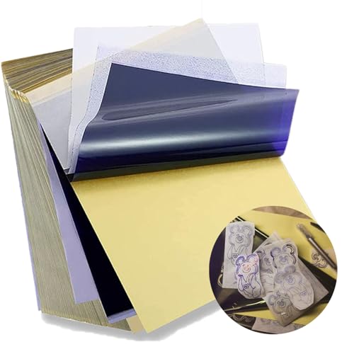
Standard size: Tattoo Transfer Paper is standard A4 paper size, each measures 8.27 in X 11.69 in. There are 4 levels in total. The thickness of the paper is very light and smooth to the touch.

Warm Tips: The tattoo transfer paper need to work with transfer medias.You will need to purchase the stencil ointment separately. Apply the design made on the master paper. Please pay attention to press the back side of the pattern to the skin for at least 3 seconds
4. Funny Phrases
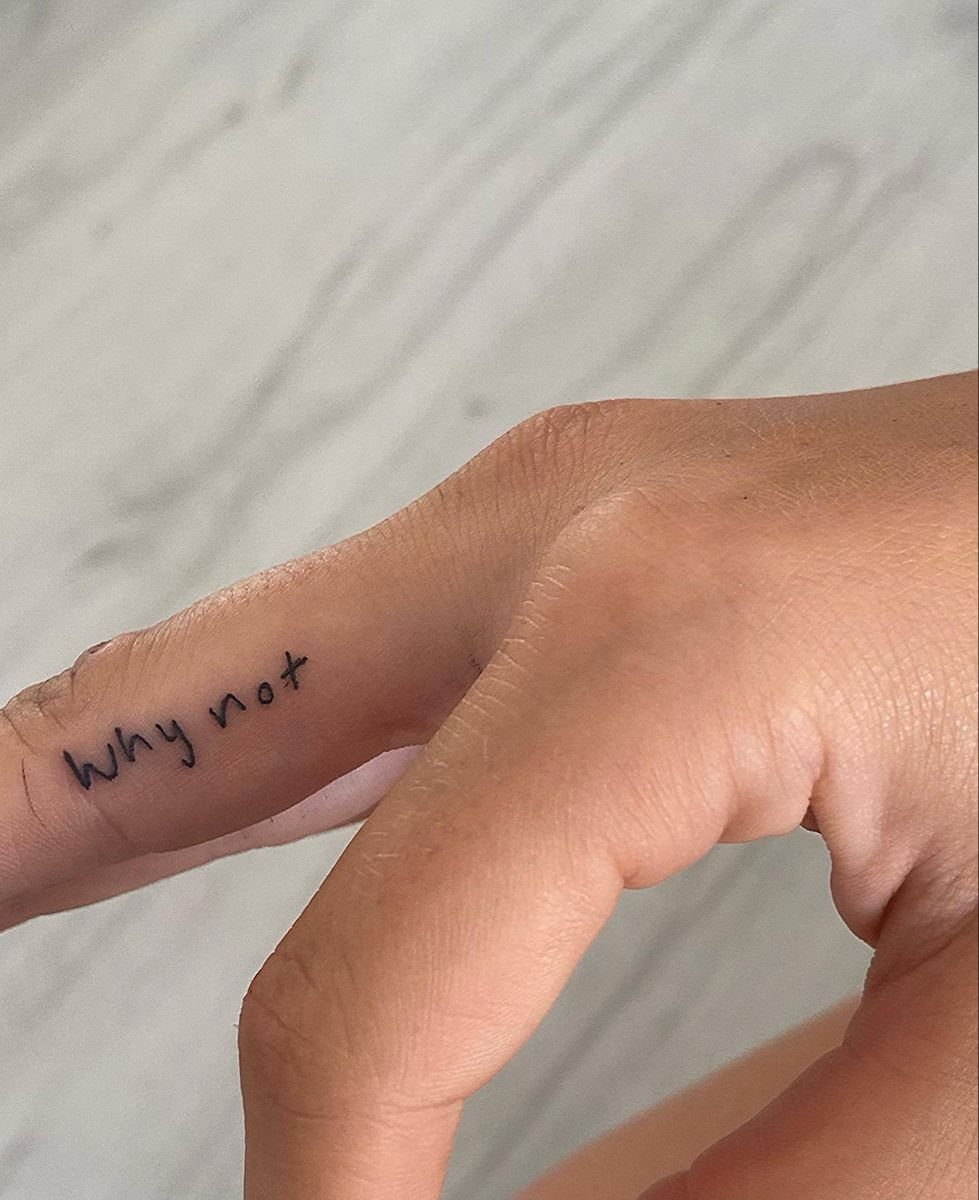
Humor on a finger has to land in 2 words or fewer. A two-word shrug of a phrase works because it sounds like something you would actually say.
WTF works for the same reason: immediate, no explanation, reads across a bar or a meeting table depending on which finger you choose.
A longer joke phrase is funnier on paper than on skin; too many letters at finger scale become a blur.
The shorthand matters more than the joke. A finger tattoo is seen at handshake distance, not read like a poster.
The playful part depends on placement. Inside the finger, toward the palm, and the joke is yours.
Outside, toward the world, and it becomes a conversation starter whether you want one or not. Pick the spot before you pick the phrase.

PRECISE OUTLINE WORK: Stencil pen refills are made for clear, controlled outline placement before a session, helping create visibility for detailed design planning. The fine, accurate positioning for eyebrow microblading, piercing preparation, and cosmetic mapping makes each refill useful for experienced artists as well as first-time users
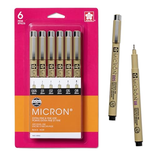
Precise archival pens create fade resistant, waterproof, bleed free marks for drawing, artwork, journaling, and more

6 ESSENTIAL SIZES FOR ULTIMATE PRECISION: Capture every detail with our curated selection of 6 micro-line nibs: 005 (0.20mm), 01 (0.25mm), 02 (0.30mm), 03 (0.35mm), 05 (0.45mm), and 08 (0.50mm). From hair-thin delicate lines to bold, impactful strokes, this set provides the perfect range for all your sketching and technical needs.
5. Roman Numerals
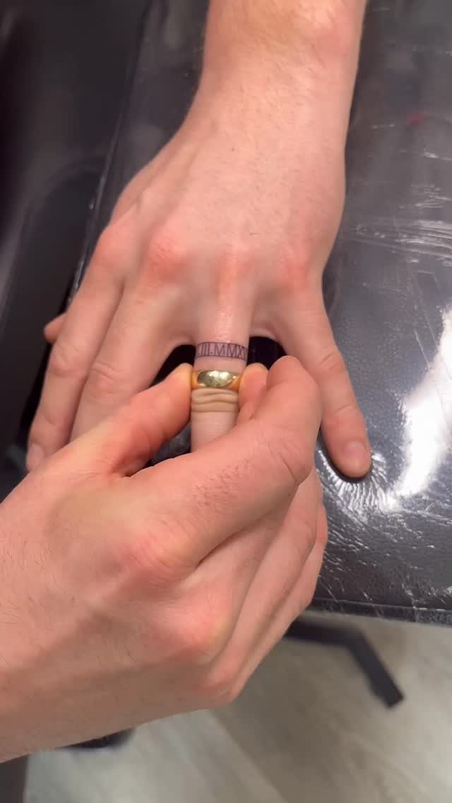
Roman numerals turn a date into pattern first, information second. Roman numerals read as thin black lines and dots until you look closer, which suits a wedding date or anniversary you carry but do not announce.
The horizontal arrangement, lined straight along the ring finger, needs a steady hand from the artist. Numerals with many letters spread wide; keeping them to a single line with periods as dividers holds the shape compact.
A border of thin lines, like the visible piece, frames the numbers and helps them hold shape as the ink settles.
This trades readability for privacy.
Someone has to ask, or you have to show them. For a date that matters but does not need explaining, that is the right trade.

Hawink New Tattoo Finger Ledge Cartridge Needle,Exquisite in every step of production,Make your tattoo work exceptionally smooth and joyful.

PACKAGE INCLUDING: 50pcs mixed size tattoo cartridge needles set, includes 10pcs each of 1203RL 1205RL 1207RL 1209RL 1211RL; The needle edges are specially designed to catch more ink; Great gifts for tattooists and beginners; Wormhole Tattoo cartridge needles are each needle cartridge is individually packed and sealed, much safer and more convenient;

Hawink New Tattoo Finger Ledge Cartridge Needle,Exquisite in every step of production,Make your tattoo work exceptionally smooth and joyful.
6. Fine Line Tattoos on the Side of Fingers
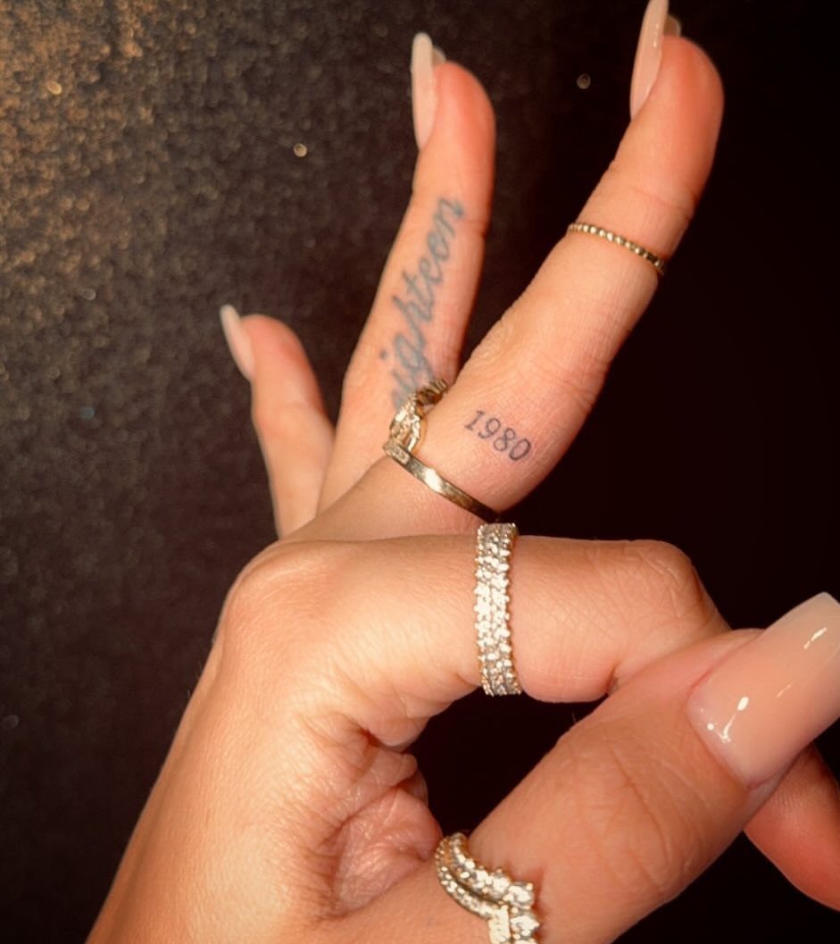
Fine line work on the side of the finger lives or dies by the artist’s machine control.
Numbers and words can sit side by side at different weights, the figures bolder, the text lighter, both readable because the lines stay steady.
The side placement, not the pad or the knuckle, keeps the tattoo from the worst wear.
Rings help or hurt depending on fit; loose bands rub, tight ones protect. A short word plus one small symbol is about the limit before finger ink starts to spread and muddy the detail.
This style needs a specialist.
General shop work on fingers often blows out; the skin is thin, the needle moves fast, and the margin for error is a millimeter. Ask specifically for healed photos of finger work, not fresh ones, before you book.

Our 2 inch thermal tattoo stencil paper adopts professional 2-layer composite structure with uniform thermal coating, delivering ultra-sharp, smudge-free transfer effects. Perfect for tiny lettering, thin outlines and delicate mini patterns, no blurry or faded lines on finger, ear, wrist small tattoos. The thick base paper resists tearing during printing and transferring, stable for all daily tattoo creation.

Package included: 30 sheets temporary letter tattoo stickers with 10 styles, each style have 3 sheets(10 letter stickers are arranged on 2 large stickers, and you will receive a total of 6 large stickers.). You can customize custom name tattoos, which have fashion style and color,make you look more unique and cool. Enough to meet your use and replacement needs.

【 575+ Fun Assorted Tattoo Stencils 】-The ChurlChurl tattoo stencils collection includes 575 high quality stencils with multiple themes. enjoy cute trendy tattoo stencil designs like butterflies, words, flowers, symbols, totem, Egypt style patterns and more.
7. Words with Small Symbols Like Hearts
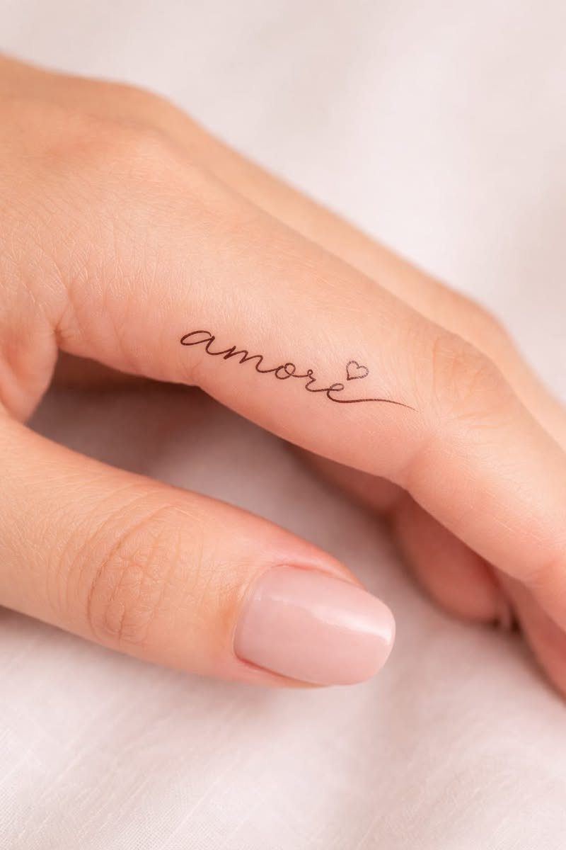
A word plus one symbol is the most a finger can carry without turning into a smudge.
"Amore" with a heart, or "family" with the same, keeps both parts readable because the symbol stays outline-thin and the lettering leaves it room.
The heart works better than a star here; its curves echo cursive and it reads instantly at finger scale.
Stars with points tend to close up as the ink settles. Placement matters: the symbol sits best at the word’s end, not mid-line where it breaks the reading flow.
This is the choice for someone who wants the meaning explicit.
A plain word asks the viewer to guess; the heart removes the guesswork. Pick a word you have actually spoken to the person it names, and a symbol that matches the tone of that conversation.

Sexy Phrase Thigh Tattoo Design: This semi-permanent tattoo set highlights a handwritten-style phrase “Heaven Sent” designed for bold and expressive placement. The flowing script creates a natural, body-contouring effect that enhances curves, especially on thigh, hip, or waist. Perfect for women who love confident, sexy, and statement tattoos that express personality and attitude with a clean yet eye-catching style.

Design Experimentation:Our finger Tiny Tattoo tattoo practice pad with more than 80 stencil designs,it can nables artists to experiment with new designs, patterns, and shading techniques.

【ELEGANT FINGER DESIGNS】 Package includes 64 sheets of delicate temporary tattoos featuring classic floral, leafy, and line patterns. Perfect as stylish finger rings, hand decorations, or subtle body accents to match your daily fashion.
Frequently Asked Questions
What are some meaningful finger tattoos?
Single initials, short words like "family" or "grateful," and Roman numerals for dates all carry weight without crowding the space.
A cursive initial from someone you raised, the exact phrase you said at the altar, or the numbers from the day you met; finger ink stays yours until you extend your hand.
The meaning holds because the design stays small enough to read at handshake distance.
How small can tattoo artists write?
A single letter or a short word of 2-5 narrow characters is the practical limit for finger skin.
The outer edge runs longer than the pad, though a stretched word drifts toward the knuckle and warps every time you make a fist.
The artist measures breathing room in single millimeters; go too light and the ink feathers outward, too heavy and the letters pool into one solid bar.
How much does it cost to get your fingers tattooed?
Finger work costs more than the size suggests because the artist must work small and slow.
Budget extra time for the session and plan on a touch-up once the skin settles; hands move, wash, and bump into things during healing, so the first pass rarely holds perfectly.
Do finger tattoos hurt?
Yes. Some fingers hurt more than others, and everyone carries pain differently, but the bone sits close to the surface here and the skin is thin; nobody mistakes this for an easy spot.
The discomfort is honest and immediate, not a dull background ache like fleshier areas.
How long do finger tattoos last?
Finger tattoos typically last several years, though their life varies with placement, aftercare, and daily wear. The side of the finger holds better than the pad or knuckle because it escapes the worst friction from gripping and bumping.
Even so, expect fading and plan for touch-ups; hands live in water, soap, and sunlight more than most skin.
What is the best lettering for tattoos?
For fingers specifically, fine cursive with clean connecting lines works best because it saves space and reads like actual handwriting.
Sans-serif or block letters at this scale tend to close up or blow out; the flowing strokes of cursive leave breathing room between characters.
Ask to see healed photos of the artist’s finger lettering before you book, and keep whatever style you choose to a thin, consistent line weight.